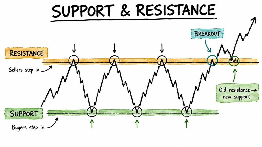
Open any trading channel and you will see charts covered in horizontal lines, drawn with great confidence, at prices carried to two decimal places. Most of that is theatre. But underneath it there is a real idea, and it is a simple one that does not need any mysticism to explain. Prices have memory. Not because the market is conscious, but because the people in it are. They remember what they paid, what they wished they had sold at, and where things turned around last time. Those memories become orders, and orders cluster.
That is all support and resistance are. Let us take the idea seriously and also keep it honest about what it cannot do.
1. What They Actually Are
Support is a price area where buying has previously been strong enough to stop a fall. Resistance is a price area where selling has previously been strong enough to stop a rise.
Why do these areas form at all? Three reasons, none of them magical.
- People remember their own prices. Someone who bought at 1,240 and watched it fall to 1,100 has spent months waiting to get out at breakeven. When price returns to 1,240, they sell. That is not sentiment, it is supply arriving at a specific number.
- People remember missed chances. Someone who watched a stock bounce off 1,240 and rise fifty rupees will put a buy order near 1,240 next time, hoping to catch the same move.
- People think in round numbers. Far more orders sit at 1,200 and 1,500 than at 1,237 or 1,483. Nothing about the business changes at a round number. The behaviour of the people trading it does.
There is an uncomfortable implication in all of this, and it is worth stating rather than hiding. These levels work partly because enough people are watching them. That is a genuine mechanism, not a trick, but it also means they are not laws of nature. A level holds until the balance of buyers and sellers there changes, and then it stops holding, often without warning.
Anyone who tells you a level “must” hold has misunderstood what they are looking at.
2. They Are Zones, Not Lines
This is the single most common beginner error, and it costs real money. Someone decides support is at 1,241.35, places a stop at 1,241, and watches price dip to 1,238 before turning and running up forty rupees without them. The idea was right. The precision was imaginary. Price is a negotiation between thousands of people, not a measurement. Suppose a stock turned upward three times over six months:
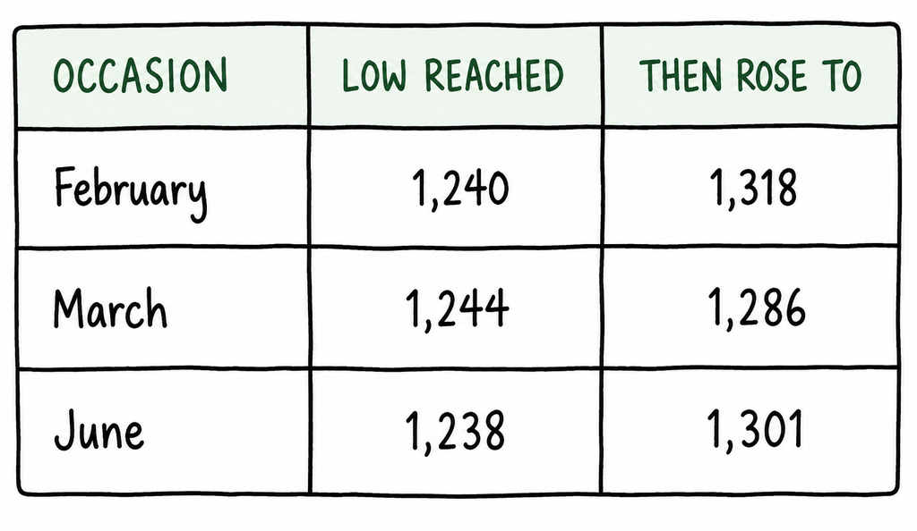
There is no single support price here. There is a band, running from roughly 1,236 to 1,246. That is about ten rupees wide, or a little under 1% of the price. Thinking in bands changes your behaviour in two useful ways. You stop being surprised when price pokes below the lowest previous low, because that is inside the zone rather than a failure of it. And you place stops beyond the band rather than inside it, which is the difference between being stopped out by noise and being stopped out by being wrong.
How to actually draw one
Open a daily chart with six months or so of history. Find the places where price clearly turned and stayed turned. Mark the area rather than the exact tick: the bodies of the candles give you the inner edge of the zone, the wicks give you the outer edge. Two or three obvious turns are enough. You are looking for the levels that announce themselves, not the ones you have to hunt for.
This is the useful test: if you find yourself squinting, or drawing a fourth and a fifth line to make a story hold together, stop. The levels worth trading are the ones you spot in the first thirty seconds, because those are the ones everybody else can see too, and being visible to everybody else is the entire source of their power.
3. What Makes a Level Worth Watching
You can draw a line under any wiggle on a chart. Most of them mean nothing. A few things separate the levels worth attention from the ones you are inventing.
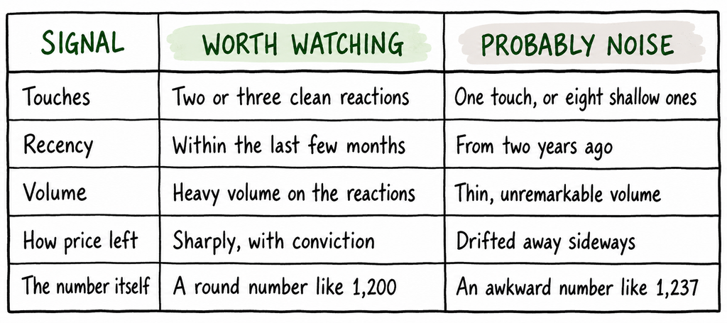
One line in that table deserves explanation, because it runs against what most people assume. More touches are not automatically better. Think about what a touch actually consumes. If there are buy orders sitting around 1,240, then every visit to that area uses some of them up. Two or three visits leave a level that has proven itself. Eight visits, each bouncing a little less than the last, describe a level being slowly eaten. By the time you notice how reliable it looks, most of the buying that made it reliable has already been spent.
Which chart’s level counts
A level on a five minute chart and a level on a weekly chart are not the same kind of object, and treating them as equals is a quiet source of confusion. The difference is simply how many people have seen it. A weekly level represents months of accumulated decisions by everyone holding that stock. A five minute level represents the last hour of decisions by whoever happens to be at their screen. Both are real. They carry very different weight.
Two practical consequences follow. Mark your levels on the daily chart even if you trade something faster, because that is where the meaningful ones live. And when a short timeframe level and a daily level disagree, expect the daily one to win. A level that shows up on both is worth more than either on its own. Those are rare, and they are the ones to write down.
4. When Support Becomes Resistance
This is the one idea in this article that repays real attention, because it follows directly from the human behaviour we started with. When a level breaks, it frequently changes role. Old resistance becomes support. Old support becomes resistance. Take a stock that failed three times near 880, then finally broke through and reached 910. Weeks later it drifts back down to 878. Very often it stops there and turns up again. The ceiling has become the floor.
The reason is entirely mundane. Three groups of people are now interested in 880:
- Those who bought below 880 and sold into the old ceiling, who now regret selling and want back in at the price they left.
- Those who watched the breakout and felt they had missed it, who have been waiting for any pullback to that level.
- Those who bought the breakout at 900 and are now nursing a small loss, who will defend the position rather than sell it.
Three separate motivations, all producing buy orders in the same small area. That is the whole mechanism. It also tells you when to be sceptical of the flip. If price crawled through 880 slowly over several weeks rather than breaking cleanly, none of those three groups exists in any strength. Nobody feels they missed anything, and nobody is trapped. The level has no reason to hold on the way back.
A real break and a false one look identical at first
Price trading beyond a level is not the same as price breaking it. Very often a stock pushes through, attracts a wave of buyers who think the move has started, and then falls straight back inside the zone, leaving those buyers holding a loss. At the moment it happens, a genuine break and a false one look the same. That is precisely why breakout trading is harder than it appears on a chart you are reviewing afterwards.
A few things make a break more believable. Volume noticeably above the recent average. A close beyond the zone rather than a poke through during the session. A quick, decisive move away rather than a hesitant one. And price not sliding straight back inside over the next few bars. None of that is proof. Convincing breaks fail regularly. All those signs do is shift the odds slightly in your favour, and slightly is the most anyone gets. Which points at the real answer, and it is not better detection. It is smaller size, so that being wrong about a break costs you an amount you had already decided you were willing to lose.
5. Using This Without Fooling Yourself
Here is the part that matters more than the drawing.
A level is a place to decide, not a prediction. Support does not tell you a stock will rise. It tells you where you will find out whether it is going to. That is a different and much more useful thing, because it gives you a location for your stop and therefore a number for your position size.
Draw levels before, never after. Looking at a finished chart, you will always find lines that “worked”. Your eye is very good at locating them and very bad at noticing the twenty places where the same lines failed. Mark your levels on a quiet evening, write them down, and then watch what actually happens to them. Levels identified after the move are worth nothing at all.
Expect most of them to fail. This is not pessimism, it is just sums. If your levels held reliably, everyone watching the same chart would be rich. They break often, and a method that only survives when levels hold is not a method.
Which is why none of this is much use on its own. A level tells you where to put a stop. It does not tell you how much to risk, when to stop for the day, or what to do after three losses in a row. Those belong to the plan you wrote before the market opened, which is the subject of building a trading plan before the opening bell, and to sizing the position, which is the next article in this series.
Support and resistance are a way of reading where other people have made decisions before. They are genuinely useful for that, and useless as prophecy.
Draw the zones. Keep them wide. Write them down before the session. Then let the market tell you which ones meant anything.
This is educational content, not personal financial advice or a recommendation to trade. Trading in equities and derivatives carries a real risk of substantial loss, and SEBI’s own studies show most individual traders lose money. The prices used above are invented illustrations of an idea, not analysis of any actual stock. For decisions about your own money, speak to a SEBI-registered investment adviser. Past returns don’t mean future returns will be the same. Everything can fall. Everything can go up. Trade accordingly, or don’t.